如何在 React Native 中实现无侵入式的阴影效果
本文由 AI 协助更新
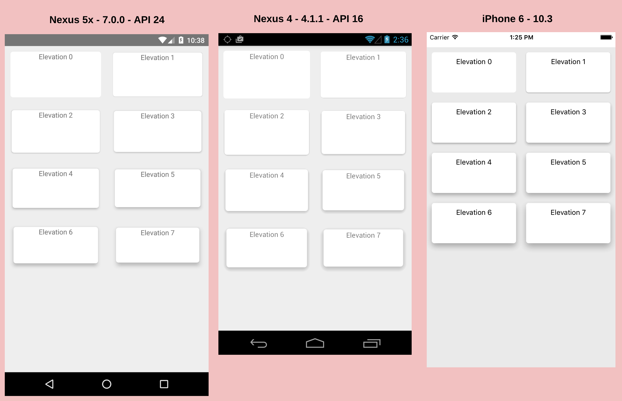
在 React Native,iOS 平台和 Android 平台实现阴影的默认方式是不一致的,阴影的效果也不同。
本文试图找出一个最佳的实现方式。在此之前,先来看看有哪些实现方式。
遵从平台各自的实现方式
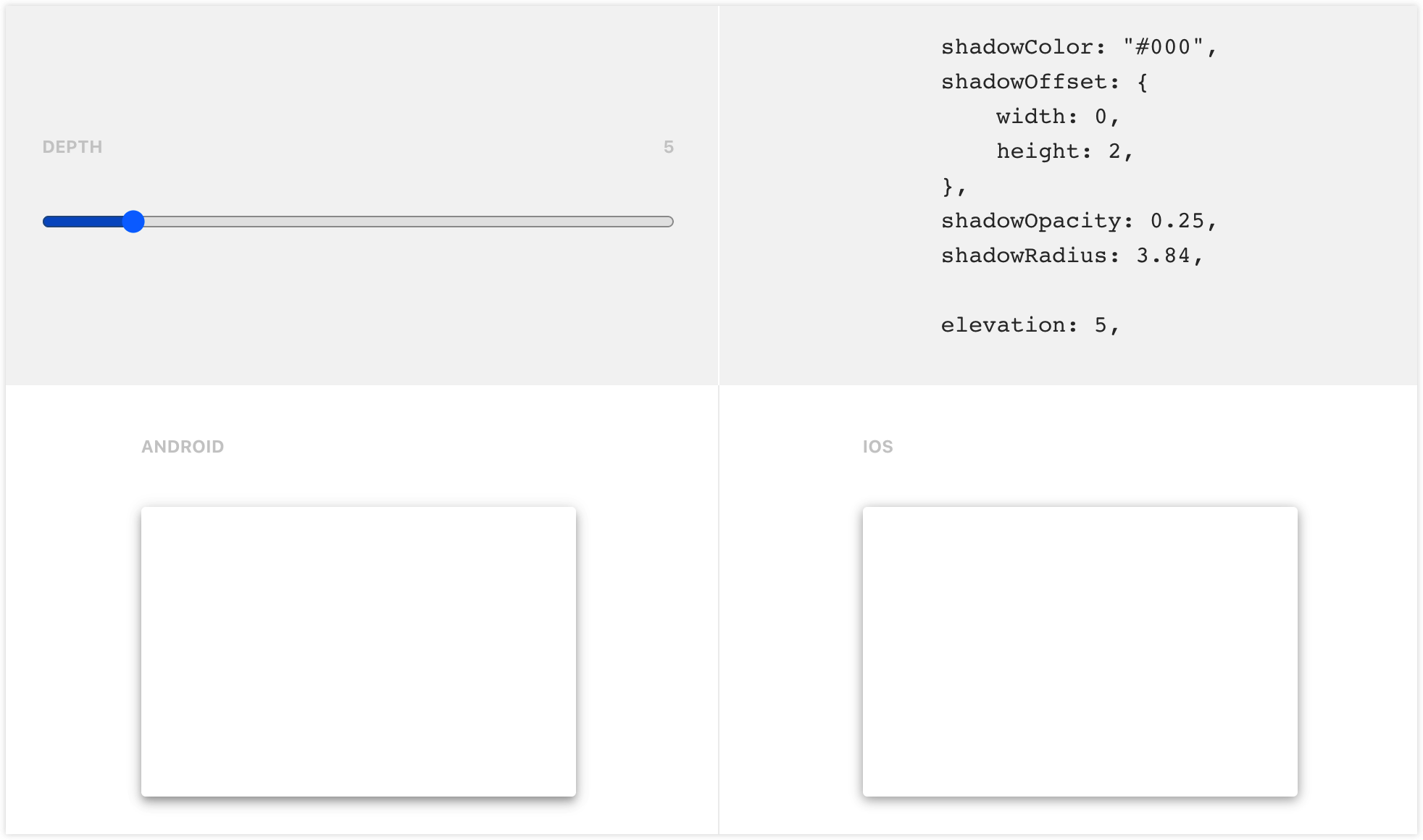
这种方式就是 iOS 通过 shadowOffset shadowOpacity shadowRadius 来实现阴影,而 Android 则通过 elevation 来实现阴影。
<View
  style={{
    shadowColor: '#222222',
    shadowOffset: { width: 2, height: 2 },
    shadowOpacity: 0.2,
    shadowRadius: 3,
    elevation: 5,
  }}>
  ...
</View>
UI 设计稿,譬如 Sketch,是可以设置 shadowX 这些属性的,这使得 iOS App 能还原设计稿,而 Android App 不能。
为了能让两个平台的阴影效果一致,react-native-cardview通过一种我看不懂的算法,试图调和这些属性,使得 iOS App 和 Android App 的阴影效果一致。
它只需要设置 cardElevation 和 cornerRadius 这两个属性,剩下的他就自己算了。但问题是,UI 设计稿上的数值怎么转换成这些属性的值呢?
<CardView cardElevation={2} cornerRadius={5}>
  <Text>Elevation 0</Text>
</CardView>
也可以反其道而行之,由 elevation 倒推出 shadowOffset shadowOpacity shadowRadius 的值。
如果你的 App 是 Material Design 的话,那么这个工具可能会很有用。
编写原生组件来实现阴影
能不能编写一个 Android 原生组件来支持阴影呢?不止一个人这么做了。
react-native-simple-shadow-view 和 react-native-drop-shadow 就是这样的组件。它们的实现原理都是根据传递进来的 shadowOffset shadowOpacity shadowRadius shadowColor 等属性,来生成一张 Bitmap 作为阴影。
react-native-simple-shadow-view 已经不维护了,我们来看看 react-native-drop-shadow 的效果。
这篇博文 Applying box shadows in React Native 介绍了如何在 React Native 中使用阴影。作者参考了里面的例子。
import DropShadow from 'react-native-drop-shadow'

function ShadowBox() {
  return (
    <View style={styles.container}>
      <DropShadow style={[styles.card, styles.boxShadow]}>
        <View>
          <Text style={styles.heading}>
            React Native cross-platform box shadow
          </Text>
        </View>
        <Text>Using the Platform API to conditionally render box shadow</Text>
      </DropShadow>
    </View>
  )
}

const styles = StyleSheet.create({
  container: {
    flex: 1,
  },
  heading: {
    fontSize: 18,
    fontWeight: '600',
    marginBottom: 13,
    lineHeight: 30,
  },
  card: {
    backgroundColor: 'white',
    paddingVertical: 45,
    paddingHorizontal: 25,
    width: '100%',
    borderRadius: 8,
  },
  boxShadow: {
    shadowColor: '#222222',
    shadowOpacity: 0.24,
    shadowOffset: { width: 0, height: 0 },
    shadowRadius: 4,
    margin: 36,
  },
})
啊哈,请问 Android 的阴影在哪?
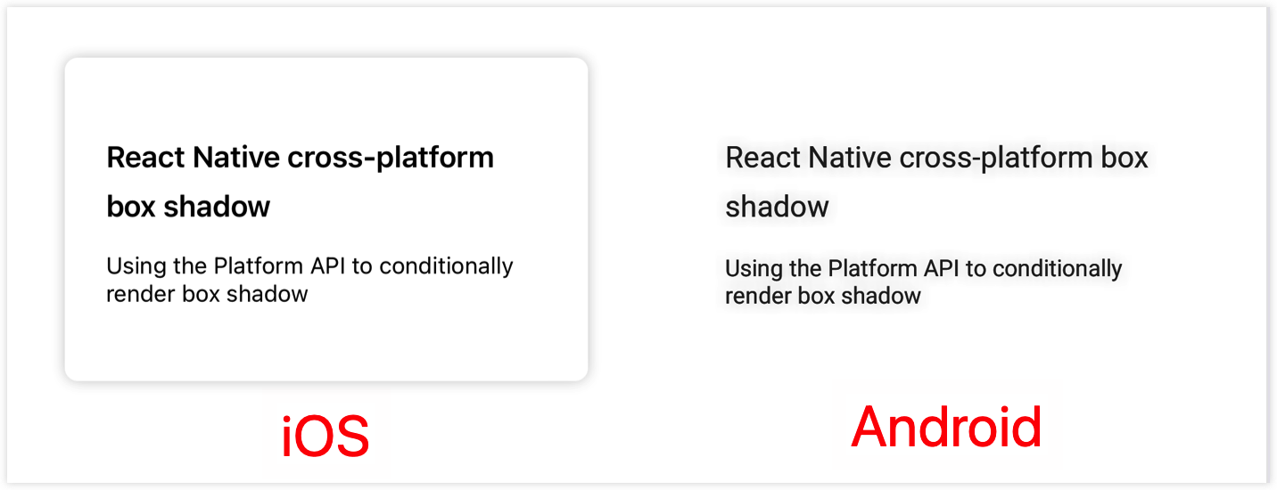
经过作者一番思索,发现这个控件,它只有一个子节点的时候,才能正常工作。修改上面的代码如下:
import DropShadow from 'react-native-drop-shadow'

function ShadowBox() {
  return (
    <View style={styles.container}>
      <DropShadow style={styles.boxShadow}>
        <View style={styles.card}>
          <View>
            <Text style={styles.heading}>
              React Native cross-platform box shadow
            </Text>
          </View>
          <Text>Using the Platform API to conditionally render box shadow</Text>
        </View>
      </DropShadow>
    </View>
  )
}
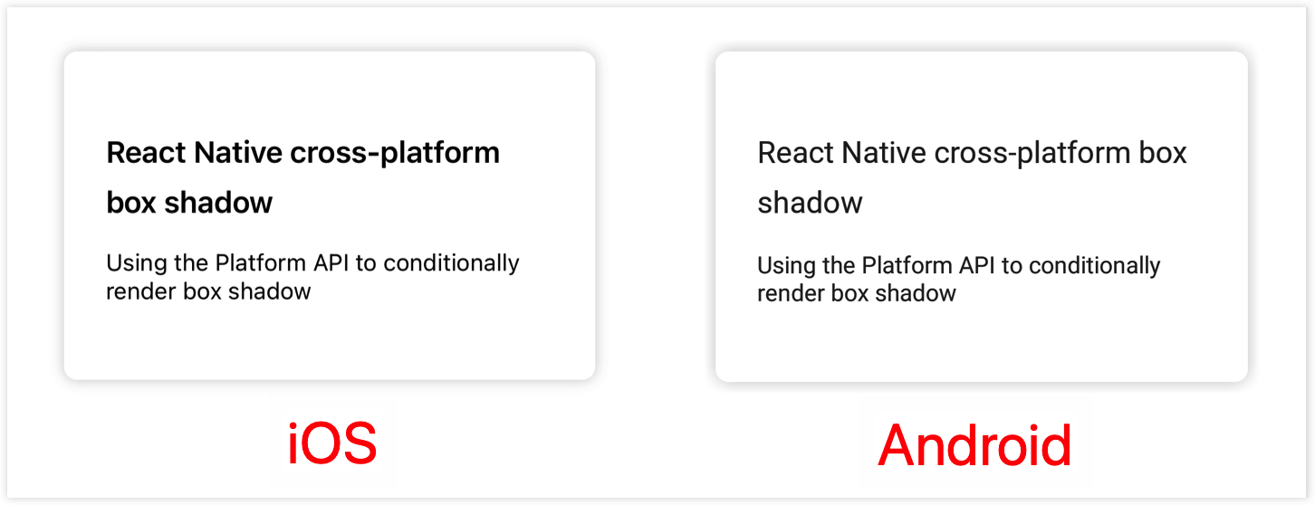
看起来还不错的样子,感觉 Android 的阴影相对有点粗。
使用 svg 来实现阴影
社区还有一种方法,就是使用 svg 来实现阴影。
react-native-neomorph-shadows 底层使用了 react-native-art 来实现阴影,但是 art 已经不再维护了,它推荐我们使用 react-native-svg 来代替。
react-native-shadow 正是基于 svg 来实现的阴影,但是它已经死了很多年。
就在几个月前,react-native-shadow-2 诞生了。它声称自己继承了 react-native-shadow,并且没有 react-native-shadow 那些毛病。
react-native-shadow-2 使用如下 UI 结构来包裹我们的组件,其中 shadow 就是使用 svg 生成的阴影,children 则是我们的组件。
<View style={containerViewStyle} pointerEvents="box-none">
  <View style={[{ ...StyleSheet.absoluteFillObject }]}>{shadow}</View>
  <View style={[viewStyle]}>{children}</View>
</View>
现在让我们来看看,它实现的阴影效果是否和 iOS 的默认效果一致。
yarn add react-native-shadow-2 react-native-svg
在下面的例子中,我尽量将 Shadow 和 DropShadow 所包裹的 UI 层级以及属性设置成一样。
import DropShadow from 'react-native-drop-shadow'
import { Shadow } from 'react-native-shadow-2'

function ShadowBox() {
  return (
    <View style={styles.container}>
      <DropShadow style={styles.boxShadow}>
        <View style={styles.card}>
          <View>
            <Text style={styles.heading}>
              React Native cross-platform box shadow
            </Text>
          </View>
          <Text>Using the Platform API to conditionally render box shadow</Text>
        </View>
      </DropShadow>

      <Shadow
        startColor={'#2222223d'}
        offset={[0, 0]}
        distance={4}
        radius={8}
        containerViewStyle={{ marginHorizontal: 36 }}
        viewStyle={styles.card}>
        <View>
          <Text style={styles.heading}>
            React Native cross-platform box shadow
          </Text>
        </View>
        <Text>Using the Platform API to conditionally render box shadow</Text>
      </Shadow>
    </View>
  )
}
Shadow 的属性和 View 或 DropShadow 相关属性对应关系如下:
| Shadow | View/ DropShadow |
|---|---|
| startColor | shadowColor & shadowOpacity |
| offset | shadowOffset |
| distance | shadowRadius |
| radius | borderRadius |
我们看一下效果如何:
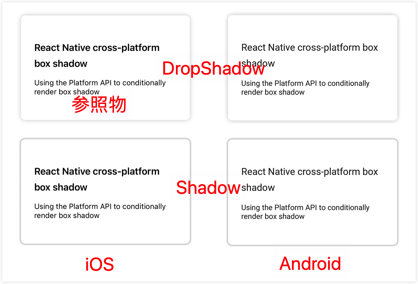
可以看到,使用 react-native-shadow-2,iOS 的阴影效果和 Android 的阴影效果是一致的。
但是有个比较严重的问题,就是 startColor 的值的计算。要怎样才能和设计稿的效果一致呢?左上角那个 iOS 默认效果就是和设计稿一致的。
react-native-shadow-2 的作者回答说,你可以做的只是调整属性(distance, startColor, offset),直到达到与你在 Figma 设计中的外观相似。
最佳方案
作者推荐使用原生组件的方式来为 Android 平台实现阴影效果。因为只需要照着 UI 稿的数值来就可以了,并且效果和 iOS 的默认效果差别不大。
但能不能像 iOS 那样,仅用一个 View 就实现阴影效果呢?
就像下面这样使用,Android 上也让 View 支持 shadowRadius、shadowOffset、shadowOpacity 等样式,由 Shim 在底层用 react-native-drop-shadow 实现。
<View style={[styles.boxShadow, styles.card]}>
  <View>
    <Text style={styles.heading}>React Native cross-platform box shadow</Text>
  </View>
  <Text>Using the Platform API to conditionally render box shadow</Text>
</View>
做法是:用 Babel 别名 + Proxy + ViewShim,让业务里 import { View } from 'react-native' 拿到的在 Android 上实际是包装了 DropShadow 的 Shim,且不依赖 RN 内部 View.render,兼容从低到高所有 RN 版本。若项目里已按 无侵入增强 React Native 组件方案 配置了 react-native 的 proxy,只需在同一 proxy 里增加对 View 的代理即可。
1. 安装依赖
本方案依赖 Babel 的 module-resolver 做别名解析;ViewShim 还需 react-native-drop-shadow。若尚未安装(若已为其他 Shim 配过可跳过):
yarn add -D babel-plugin-module-resolver
yarn add react-native-drop-shadow
按 react-native-drop-shadow 官方文档完成 iOS/Android 的 link 或 Pod 安装(如需要)。
2. Babel 配置
在 babel.config.js 的 module-resolver 里为 react-native 配置别名,指向项目中的 proxy 文件(路径按项目结构调整;若已为其他 Shim 配过可跳过):
// babel.config.js
module.exports = {
  presets: ['module:@react-native/babel-preset'],
  plugins: [
    [
      'module-resolver',
      {
        root: ['./'],
        extensions: ['.ts', '.tsx', '.ios.js', '.android.js', '.js', '.json'],
        alias: {
          '^react-native$': './app/utils/react-native-proxy.js',
          // ... 其他 alias
        },
      },
    ],
  ],
};
3. react-native-proxy 中为 View 返回 ViewShim
在 proxy 中为 View 返回 ViewShim:
下面示例中的 path/to/node_modules/react-native 是占位写法,使用时请替换为项目中指向真实 react-native 包的相对路径或绝对路径。
// app/utils/react-native-proxy.js
const RN = require('path/to/node_modules/react-native');

module.exports = new Proxy(RN, {
  get(target, prop) {
    if (prop === 'View') {
      if (!module.exports.__ViewShim) {
        module.exports.__ViewShim = require('./shim/ViewShim').default;
      }
      return module.exports.__ViewShim;
    }
    // Text、Image 等若也有 Shim 可在此一并代理
    return target[prop];
  },
});
4. ViewShim 与 splitShadowProps
ViewShim 在 Android 且 style 里包含 shadowRadius 时,把阴影相关样式拆到外层 DropShadow,其余样式留给内层 View;iOS 或未用阴影时直接渲染 RN.View。
// app/utils/shim/ViewShim.tsx
import React from 'react';
import type { ViewProps, ViewStyle } from 'react-native';
import DropShadow from 'react-native-drop-shadow';

const RN = require('path/to/node_modules/react-native');

type StyleKey = keyof ViewStyle;

function splitShadowProps(style: ViewStyle): {
  outer: Record<string, unknown>;
  inner: Record<string, unknown>;
} {
  const outer: Record<string, unknown> = {};
  const inner: Record<string, unknown> = {};

  if (style != null) {
    for (const prop of Object.keys(style) as StyleKey[]) {
      switch (prop) {
        case 'margin':
        case 'marginHorizontal':
        case 'marginVertical':
        case 'marginBottom':
        case 'marginTop':
        case 'marginLeft':
        case 'marginRight':
        case 'flex':
        case 'flexGrow':
        case 'flexShrink':
        case 'flexBasis':
        case 'alignSelf':
        case 'height':
        case 'minHeight':
        case 'maxHeight':
        case 'width':
        case 'minWidth':
        case 'maxWidth':
        case 'position':
        case 'left':
        case 'right':
        case 'bottom':
        case 'top':
        case 'shadowColor':
        case 'shadowOffset':
        case 'shadowOpacity':
        case 'shadowRadius':
        case 'zIndex':
          outer[prop] = (style as Record<string, unknown>)[prop];
          break;
        default:
          inner[prop] = (style as Record<string, unknown>)[prop];
          break;
      }
    }
  }

  if (outer.flex) {
    inner.flex = 1;
  }
  if (outer.width) {
    inner.width = '100%';
  }
  if (outer.height) {
    inner.height = '100%';
  }

  return { outer, inner };
}

const ViewShim = (props: ViewProps) => {
  const { style, ...rest } = props;

  if (RN.Platform.OS !== 'android') {
    return <RN.View style={style} {...rest} />;
  }

  const flatStyle = RN.StyleSheet.flatten(style) || {};
  if (!Object.keys(flatStyle).includes('shadowRadius')) {
    return <RN.View style={style} {...rest} />;
  }

  const styleCopy = { ...flatStyle };
  delete styleCopy.elevation;
  const { outer, inner } = splitShadowProps(styleCopy as ViewStyle);

  return (
    <DropShadow style={outer}>
      <RN.View style={inner} {...rest} />
    </DropShadow>
  );
};

export default ViewShim;
这样业务侧继续用「一个 View + 阴影 style」即可,无需改写法,且与高版本 RN 兼容。
示例
这里有一个示例,供你参考。