自定义 TabBar
tabs 容器有一个默认的 TabBar, 支持未读消息数,小红点提示等功能。它是由原生组件实现的,性能优越,满足 80% 常用场景。如果你希望对 TabBar 有更多的控制权,譬如实现如下效果:
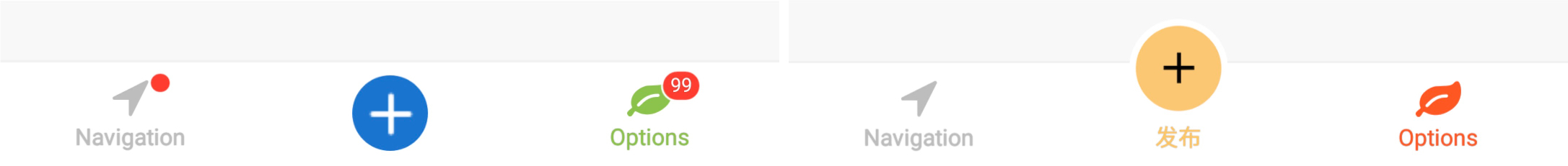
那么你需要使用 tabBarModuleName 选项来指定你的 TabBar 组件。
上图仅用于展示样式方向。你可以在业务项目中自建 src/CustomTabBar.tsx / src/BulgeTabBar.tsx 两个组件实现类似效果。
此外,需要注意以下若干事项:
注册
TabBar 组件和普通页面组件一样,需要注册
import Navigation from 'hybrid-navigation';
import CustomTabBar from './src/CustomTabBar';
import BulgeTabBar from './src/BulgeTabBar';

Navigation.registerComponent('CustomTabBar', () => CustomTabBar);
Navigation.registerComponent('BulgeTabBar', () => BulgeTabBar);
启用
在布局对象中,通过 tabBarModuleName 启用自定义 TabBar 组件。
如果不需要中间按钮凸起效果,sizeIndeterminate 需要设置为 false,同时指定 TabBar 的宽高。
import Navigation from 'hybrid-navigation';

Navigation.setRoot({
  tabs: {
    children: [],
    options: {
      tabBarModuleName: 'CustomTabBar',
      sizeIndeterminate: false,
    },
  },
});
tabBar: {
  // 56 和 48 是原生 TabBar 容器的实际高度,是固定值。
  height: Platform.OS === 'android' ? 56 : 48,
  width: Dimensions.get('window').width,
  flexDirection: 'row',
  justifyContent: 'center',
  alignItems: 'stretch',
},
如果需要实现中间按钮凸起效果,sizeIndeterminate 需要设置为 true,同时指定 TabBar 期待的(包含凸起按钮后的)宽高,以及 TabBar 的实际宽高。
import Navigation from 'hybrid-navigation';

Navigation.setRoot({
  tabs: {
    children: [],
    options: {
      tabBarModuleName: 'BulgeTabBar',
      sizeIndeterminate: true,
    },
  },
});
container: {
  // TabBar 期待的宽高
  height: Platform.OS === 'android' ? 78 : 72,
  width: Dimensions.get('window').width,
  justifyContent: 'flex-start',
  alignItems: 'center',
},
bulge: {
  justifyContent: 'center',
  alignItems: 'center',
},
// TabBar 的实际宽高以及相对于父组件的位置
tabBar: {
  // TabBar 原生底层容器的高度,这个高度是固定的。
  height: Platform.OS === 'android' ? 56 : 48,
  position: 'absolute',
  bottom: 0,
  left: 0,
  right: 0,
  flexDirection: 'row',
  justifyContent: 'center',
  alignItems: 'stretch',
},
属性
通过 props 来获取自定义 TabBar 相关属性。
可以通过 props.selectedIndex 来获取当前选中的 tab 的索引。props 还有许多有用的信息,它的数据结构如下:
{
  "sceneId": "82a466fb-4a33-452d-b53e-d5122bf93078",
  "moduleName": "CustomTabBar",
  "navigator": {
    "sceneId": "82a466fb-4a33-452d-b53e-d5122bf93078",
    "moduleName": "CustomTabBar"
  },
  "garden": {
    "sceneId": "82a466fb-4a33-452d-b53e-d5122bf93078"
  },
  "selectedIndex": 1,
  "itemColor": "#8BC34A",
  "unselectedItemColor": "#BDBDBD",
  "badgeColor": "#FF3B30",
  "tabs": [
    {
      "index": 0,
      "sceneId": "86195762-DB47-4354-AE62-753D308818BC",
      "moduleName": "Navigation",
      "title": "Navigation",
      "dot": false,
      "icon": "ic_home_selected",
      "unselectedIcon": null
    },
    {
      "index": 1,
      "sceneId": "F28EB922-FDC3-426F-B572-F1E90EFC47F8",
      "moduleName": "Options",
      "title": "Options",
      "badgeText": "99",
      "icon": "flower",
      "unselectedIcon": null
    }
  ]
}
其中 sceneId 是 tabs 容器的 sceneId,navigator 是 tabs 容器的 navigator,如果你希望获取某个 tab 页面的 navigator,可以通过如下方式:
import { Navigator } from 'hybrid-navigation';

const navigator = Navigator.of(this.props.tabs[0].sceneId);
TabBar 的背景颜色,分割线,仍然由原生控制。